
Like what you see? Let's
build something together.
Like what you see? Let's
build something together.
Like what you see? Let's
build something together.
Like what you see? Let's
build something together.
Like what you see? Let's
build something together.
GET IN TOUCH
GET IN TOUCH
GET IN TOUCH
GET IN TOUCH
GET IN TOUCH
CREATING AN IDENTITY FOR A
HOPPINGLY TASTY BEVERAGE
CREATING AN IDENTITY FOR A
HOPPINGLY TASTY BEVERAGE
CREATING AN IDENTITY
FOR A HOPPINGLY
TASTY BEVERAGE
CREATING AN IDENTITY
FOR A HOPPINGLY TASTY BEVERAGE
DELIVERABLES
Visual Identity
Packaging Designs
Yee Hop — a hop-infused Wild West cartoon extravaganza.
This project offered complete creative freedom to pour both branding and illustrative skills into bringing a bold, character-driven beverage to life — one ready to take the IPA scene hostage.
The brief: create a full visual identity and packaging design for a UK-based brewery. The goal was to craft a brand that felt unmistakably Wild West, paying homage to the fruity hop flavours imported from the US, while remaining proudly brewed in the UK.
Yee Hop — a hop-infused Wild West cartoon extravaganza.
This project offered complete creative freedom to pour both branding and
illustrative skills into bringing a bold, character-driven beverage to life —
one ready to take the IPA scene hostage.
The brief: create a full visual identity and packaging design for a UK-based brewery. The goal was to craft a brand that felt unmistakably Wild West, paying homage to the fruity hop flavours imported from the US, while remaining proudly brewed in the UK.
Yee Hop — a hop-infused Wild West cartoon extravaganza. This project offered complete creative freedom to pour both branding and illustrative skills into bringing a bold, character-driven beverage to life — one ready to take the IPA scene hostage.
The brief: create a full visual identity and packaging design for a UK-based brewery. The goal was to craft a brand that felt unmistakably Wild West, paying homage to the fruity hop flavours imported from the US, while remaining proudly brewed in the UK.
CREATING AN IDENTITY
FOR A HOPPINGLY TASTY BEVERAGE
DELIVERABLES
Visual Identity
Packaging Designs


Yee Hop — a hop-infused Wild West cartoon extravaganza. This project offered complete creative freedom to pour both branding and illustrative skills into bringing a bold, character-driven beverage to life — one ready to take the IPA scene hostage.
The brief: create a full visual identity and packaging design for a UK-based brewery. The goal was to craft a brand that felt unmistakably Wild West, paying homage to the fruity hop flavours imported from the US, while remaining proudly brewed in the UK.


DELIVERABLES
Visual Identity
Packaging Designs


YEE-HAW
YEE-HAW
YEE-HAW
YEE-HAW
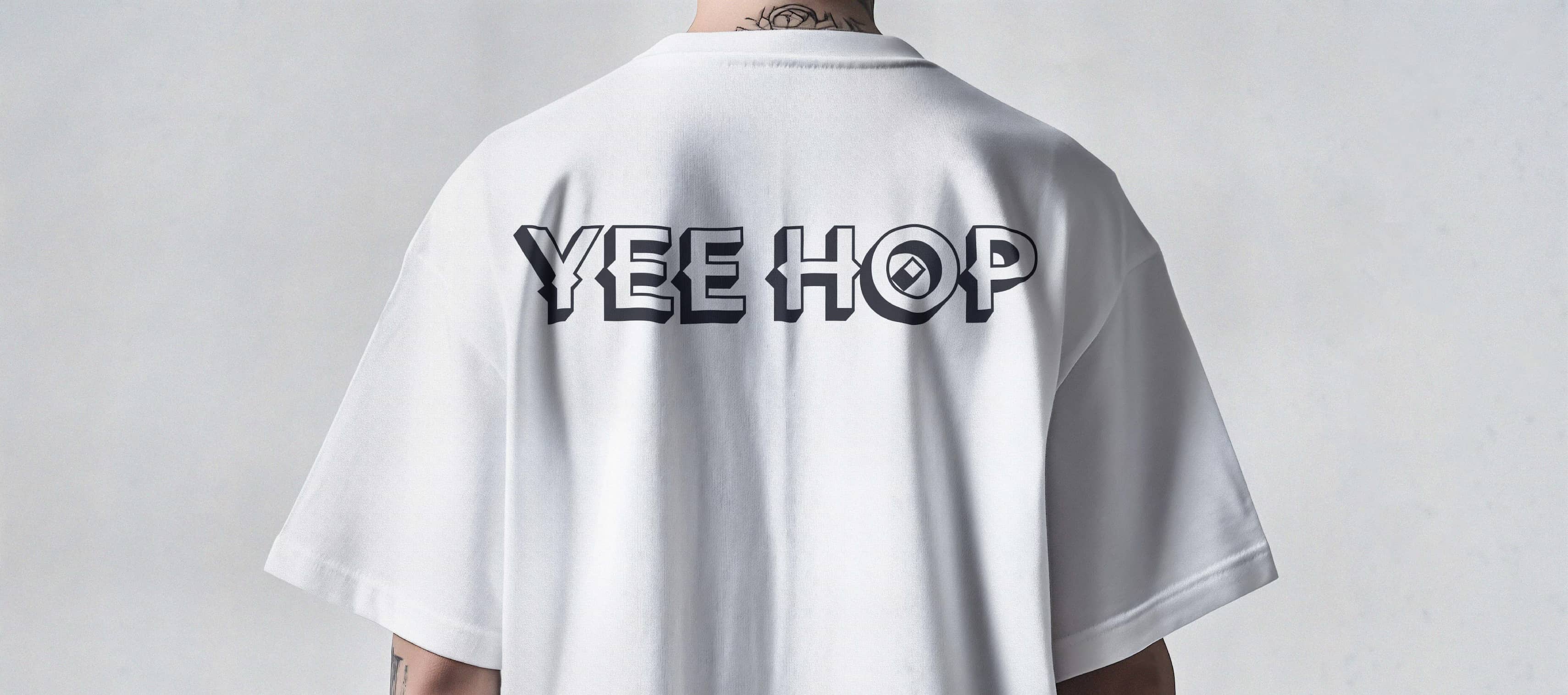
One of the key challenges with Yee Hop was developing an iconic wordmark that bridged the gap between classic American Wild West aesthetics and playful cartoon energy. Both elements needed to coexist in order to communicate the right tone and instantly connect with the consumer.
Drawing from an unhealthy childhood obsession with The Beano, I turned to a stack of old comics in my studio for reference. Traditional comic covers often feature bold, dimensional type — letters that feel as though they’re bursting off the page with impact — and this became a key influence in shaping the typographic direction.
To ground the brand in its Western roots, research led me to Tuscan typefaces, commonly found in mid-to-late 1800s wood type. These letterforms often feature medial spurs — sharp, pointed details that instantly evoke the Wild West. Rather than leaning too heavily into this style, I chose to apply the spurs selectively. Yee Hop is a modern brand, and overdoing the Western elements risked overpowering the fresh, contemporary feel.
The final wordmark blends a bold, sans-serif, three-dimensional structure with subtle Western detailing. Spurs were introduced across the characters, while the ‘O’ was treated as a central focal point — placed at the centre rather than the edges, like a bullseye — a small nod to the crisp, refreshing nature of the product.
One of the key challenges with
Yee Hop was developing an iconic wordmark that bridged the gap between classic American Wild West aesthetics and playful cartoon energy. Both elements needed to coexist in order to communicate the right tone and instantly connect with the consumer.
Drawing from an unhealthy childhood obsession with The Beano, I turned to a stack of old comics in my studio for reference. Traditional comic covers often feature bold, dimensional type — letters that feel as though they’re bursting off the page with impact — and this became a key influence in shaping the typographic direction.
To ground the brand in its Western roots, research led me to Tuscan typefaces, commonly found in mid-to-late 1800s wood type. These letterforms often feature medial spurs — sharp, pointed details that instantly evoke the Wild West. Rather than leaning too heavily into this style, I chose to apply the spurs selectively. Yee Hop is a modern brand, and overdoing the Western elements risked overpowering the fresh, contemporary feel.
The final wordmark blends a bold, sans-serif, three-dimensional structure with subtle Western detailing. Spurs were introduced across the characters, while the ‘O’ was treated as a central focal point — placed at the centre rather than the edges, like a bullseye — a small nod to the crisp, refreshing nature of the product.
One of the key challenges with Yee Hop was developing an iconic wordmark that bridged the gap between classic American Wild West aesthetics and playful cartoon energy. Both elements needed to coexist in order to communicate the right tone and instantly connect with the consumer.
Drawing from an unhealthy childhood obsession with The Beano, I turned to a stack of old comics in my studio for reference. Traditional comic covers often feature bold, dimensional type — letters that feel as though they’re bursting off the page with impact — and this became a key influence in shaping the typographic direction.
To ground the brand in its Western roots, research led me to Tuscan typefaces, commonly found in mid-to-late 1800s wood type. These letterforms often feature medial spurs — sharp, pointed details that instantly evoke the Wild West. Rather than leaning too heavily into this style, I chose to apply the spurs selectively. Yee Hop is a modern brand, and overdoing the Western elements risked overpowering the fresh, contemporary feel.
The final wordmark blends a bold, sans-serif, three-dimensional structure with subtle Western detailing. Spurs were introduced across the characters, while the ‘O’ was treated as a central focal point — placed at the centre rather than the edges, like a bullseye — a small nod to the crisp, refreshing nature of the product.

HOP IN ACTION
HOP IN ACTION
HOP IN ACTION
HOP IN ACTION
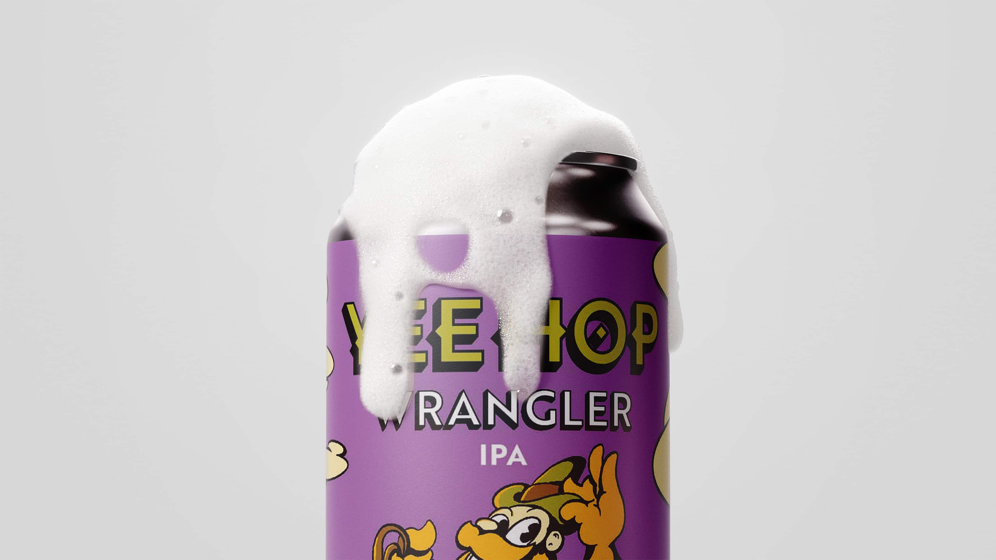
From rough to right, each label design was assigned a unique mascot to represent its flavour and personality. In doing so, I built a distinct world around each character — a self-contained domain where every cartoon protagonist could fully come to life.
Big Iron, the destructive outlaw, is depicted tearing through a town.
The Wrangler, the fearless hop tamer, rides a charging hop across the frontier.
Tin Brew, the coffee-infused kettle, sails down a river of hot coffee.
Darkmite, a volatile force ready to explode, lurks deep within the darkest caverns on the western front.
Together, Yee Hop becomes a fruit-fuelled universe bursting with flavour — bold, playful, and roaring with personality.


CREATING AN IDENTITY FOR
A HOPPINGLY
TASTY BEVERAGE
DELIVERABLES
Visual Identity
Packaging Designs
Yee Hop — a hop-infused Wild West cartoon extravaganza. This project offered complete creative freedom to pour both branding and illustrative skills into bringing a bold, character-driven beverage to life — one ready to take the IPA scene hostage.
The brief: create a full visual identity and packaging design for a UK-based brewery. The goal was to craft a brand that felt unmistakably Wild West, paying homage to the fruity hop flavours imported from the US, while remaining proudly brewed in the UK.
CREATING AN
IDENTITY FOR
A HOPPINGLY
TASTY BEVERAGE
Yee Hop — a hop-infused Wild West cartoon extravaganza.
This project offered complete creative freedom to pour both branding and illustrative skills into bringing a bold, character-driven beverage to life — one ready to take the IPA scene hostage.
The brief: create a full visual identity and packaging design for a UK-based brewery. The goal was to craft a brand that felt unmistakably Wild West, paying homage to the fruity hop flavours imported from the US, while remaining proudly brewed in the UK.
Yee Hop — a hop-infused Wild West cartoon extravaganza. This project offered complete creative freedom to pour both branding and illustrative skills into bringing a bold, character-driven beverage to life — one ready
to take the IPA scene hostage.
The brief: create a full visual identity and packaging design for a UK-based brewery. The goal was to craft a brand that felt unmistakably Wild West, paying homage to the fruity hop flavours imported from the US, while remaining proudly brewed in the UK.


